Dear all,
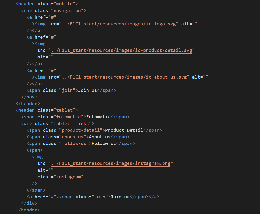
anyone knows why my layout looks as I inted when I resize my viewport but when I used toggle device toolbars they don’t apply my code.


The second image is my viewport resized and coded applied.
Dear all,
anyone knows why my layout looks as I inted when I resize my viewport but when I used toggle device toolbars they don’t apply my code.
The second image is my viewport resized and coded applied.
html code? css code?